CICERO
-
CICERO is a user-friendly lifestyle and travel app that connects users with local guides for personalised recommendations. It leverages real-time human insights for effortless discovery, providing local expertise and unique perspectives for an authentic, seamless experience—anytime, anywhere
-
User Research & Analysis, Information Architecture, Wireframing. UI Design, Prototyping and Usability Testing.
-
Figma, Adobe CS, hand sketch.
-
Define | Discover | Develop | Deliver

Highlights

Goal
CICERO aims to make discovery fun and easy by providing direct access to local expertise. By addressing diverse user needs and solving the age-old problem of saving time, CICERO offers curated experiences hand-picked by expert guides, giving users more time to explore and less time to stress about planning.
Problem
Finding authentic local experiences often causes decision fatigue due to information overload. The first challenge was understanding why a service like CICERO is useful. The second was identifying who would benefit most from the app, and the third was figuring out how to attract guides to the CICERO network.
Discover
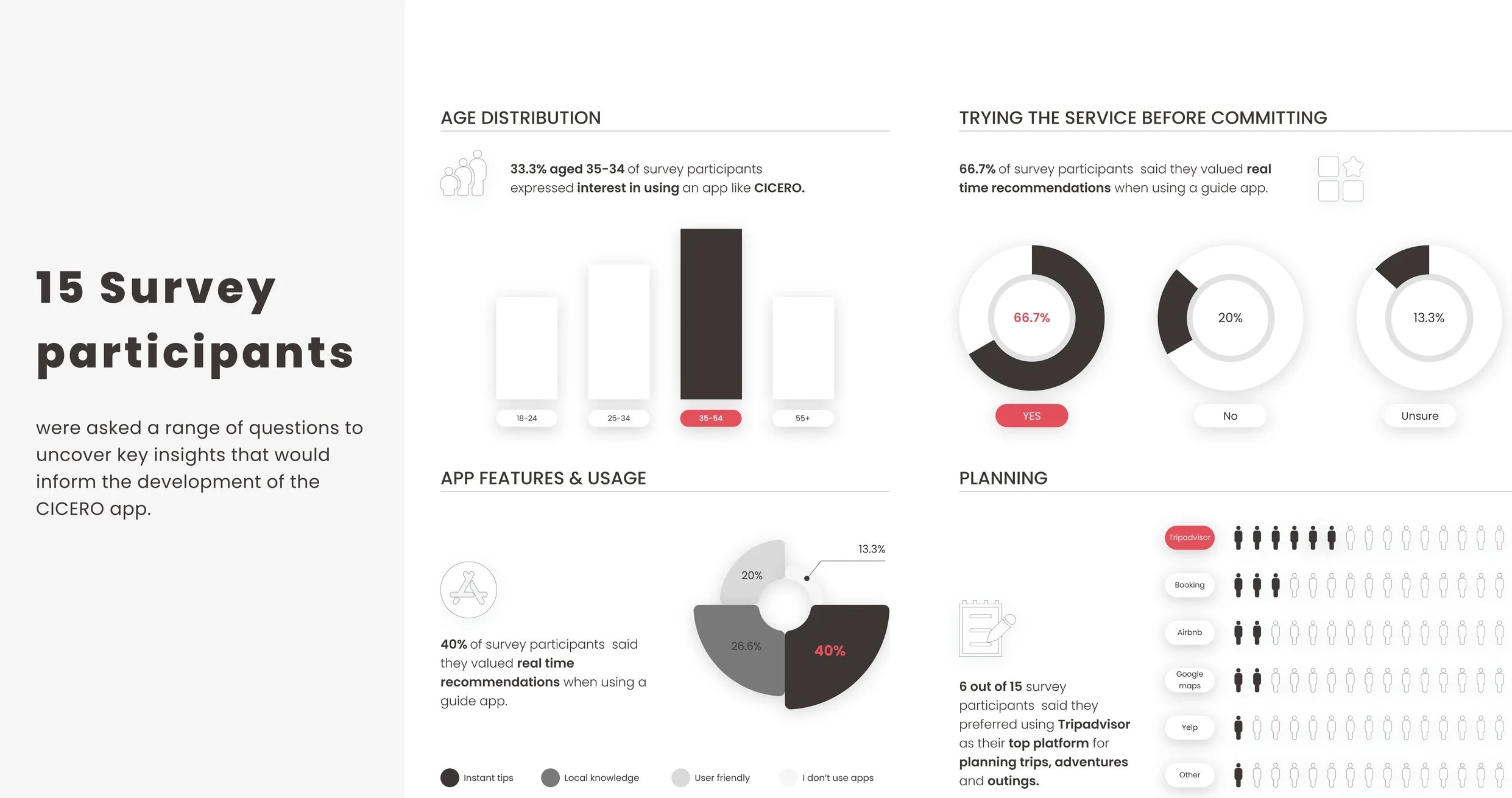
Quantitive research
What are the current trends relating to the guidance market?
I researched market trends to uncover CICERO's potential and the factors driving user engagement. Findings show a growing demand for guidance services and a strong appetite for real-time, personalised recommendations.

What role do time and effort play in how travellers approach planning their trips, and how do recommendations, reviews, and local guides influence their choices?
The research below is aimed to understand user behaviours, preferences, and expectations in travel planning and app usage. The findings provide insights into key features, design elements, and functionalities, helping to shape CICERO stand out in a competitive market.
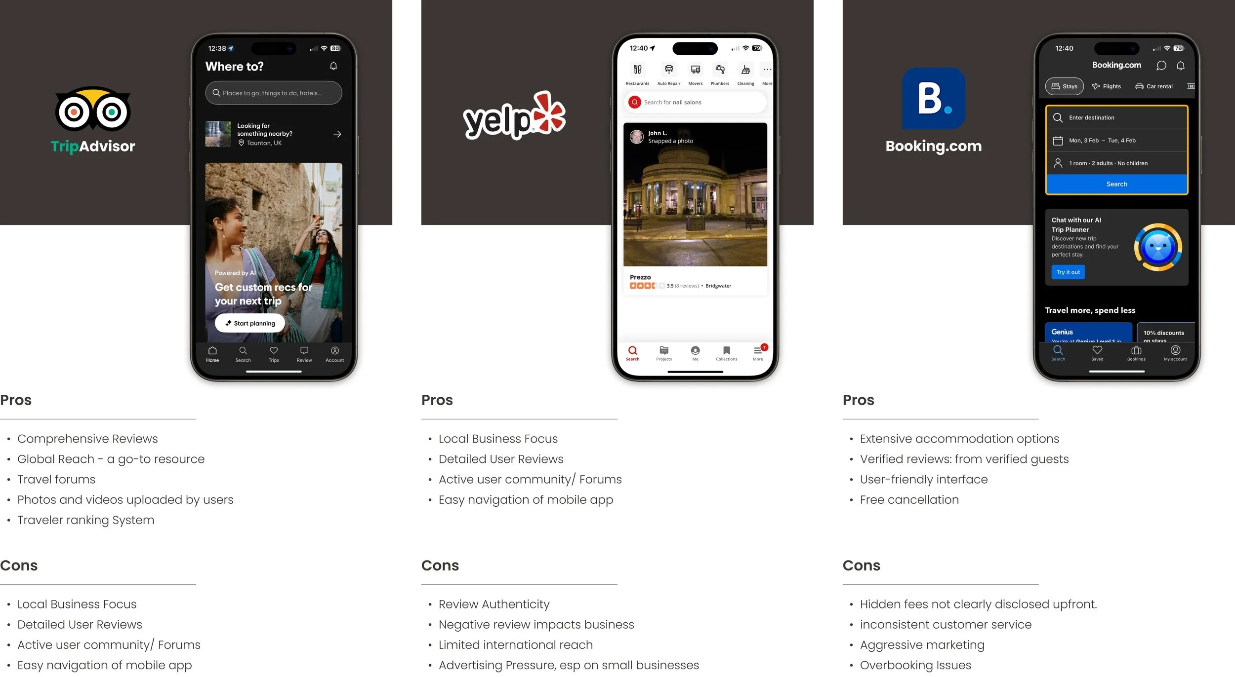
Competitor Analysis
Apps like TripAdvisor, Booking.com, and Yelp offer reviews but lack the personal touch and local expertise that make trips extraordinary.
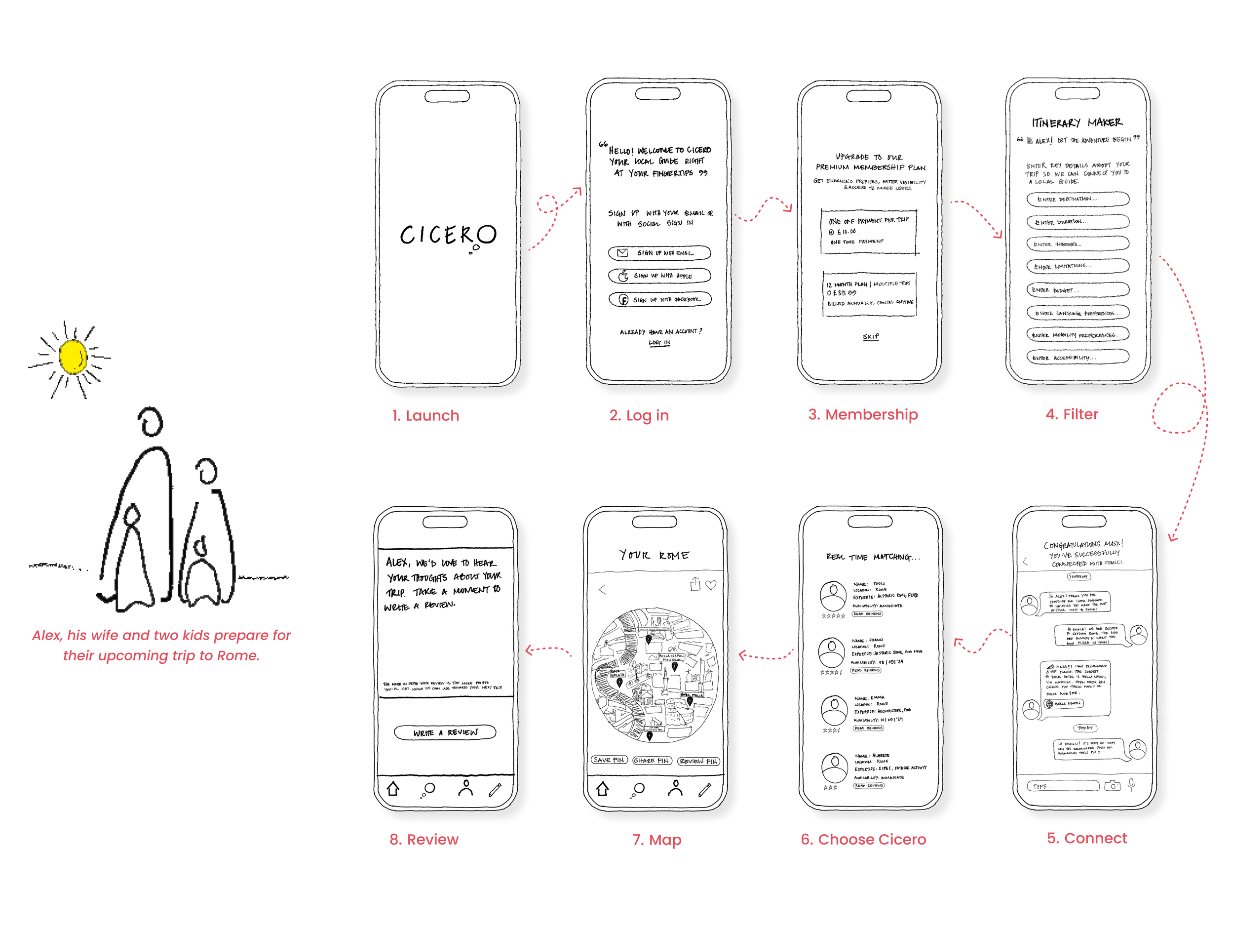
Based on these findings, I created an illustrative user journey that shaped my vision for the app’s functionality. The journey shows how a user like Alex would navigate CICERO, skipping extensive planning and diving straight into enjoying his family holiday.
Define
Persona: Who are the potential users of CICERO?
To understand user needs and pain points, several interviews were conducted with individuals to identify their travel priorities, leading to the creation of a user persona for CICERO: a busy professional who loves to travel but has to balances family life and work.

and how would CICERO be used?
Based on these findings, I created an illustrative user journey that shaped my vision for the app’s functionality. The journey shows how a user like Alex would navigate CICERO, skipping extensive planning and diving straight into enjoying his family holiday.
Develop
Information Architecture:
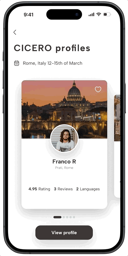
I organised the information architecture by offering users a seamless preview of the core features. By doing this CICERO builds familiarity and confidence, allowing the user to experience the app’s core values before committing to a membership.

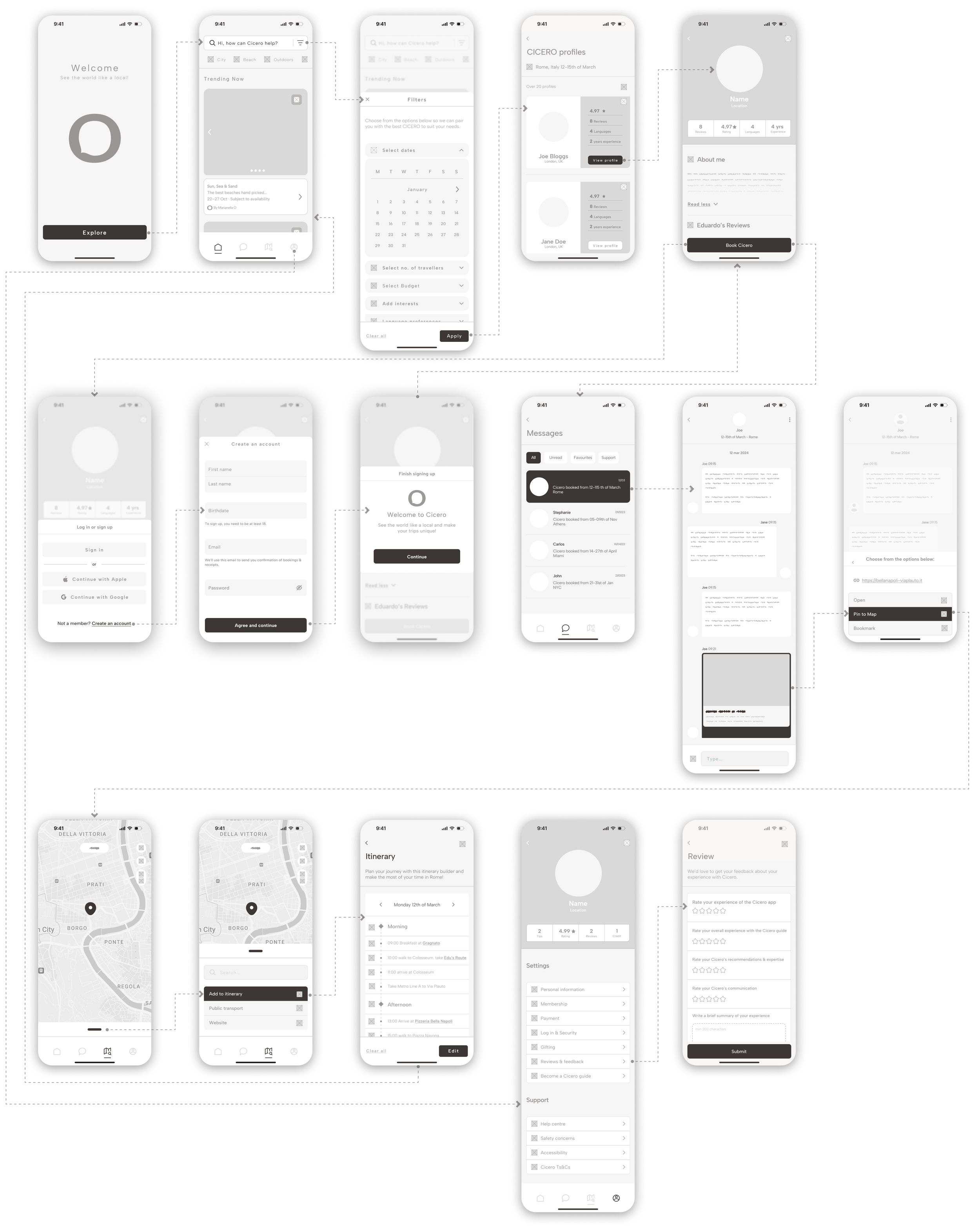
User flow:
The user flow below guides users through a streamlined onboarding process, showcasing CICERO’s value upfront and building confidence before commitment. Inspired by a Netflix study, it leverages the "try-before-you-buy" approach to encourage engagement.
Scenario: Becoming a CICERO member

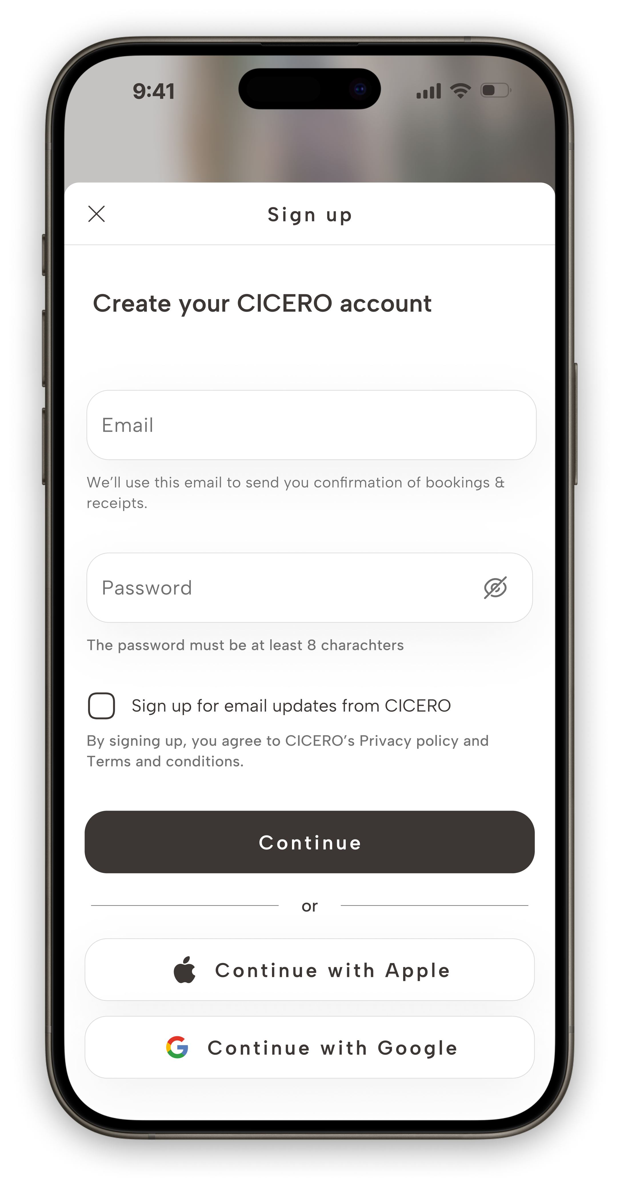
Mid-fidelity to wireframe:
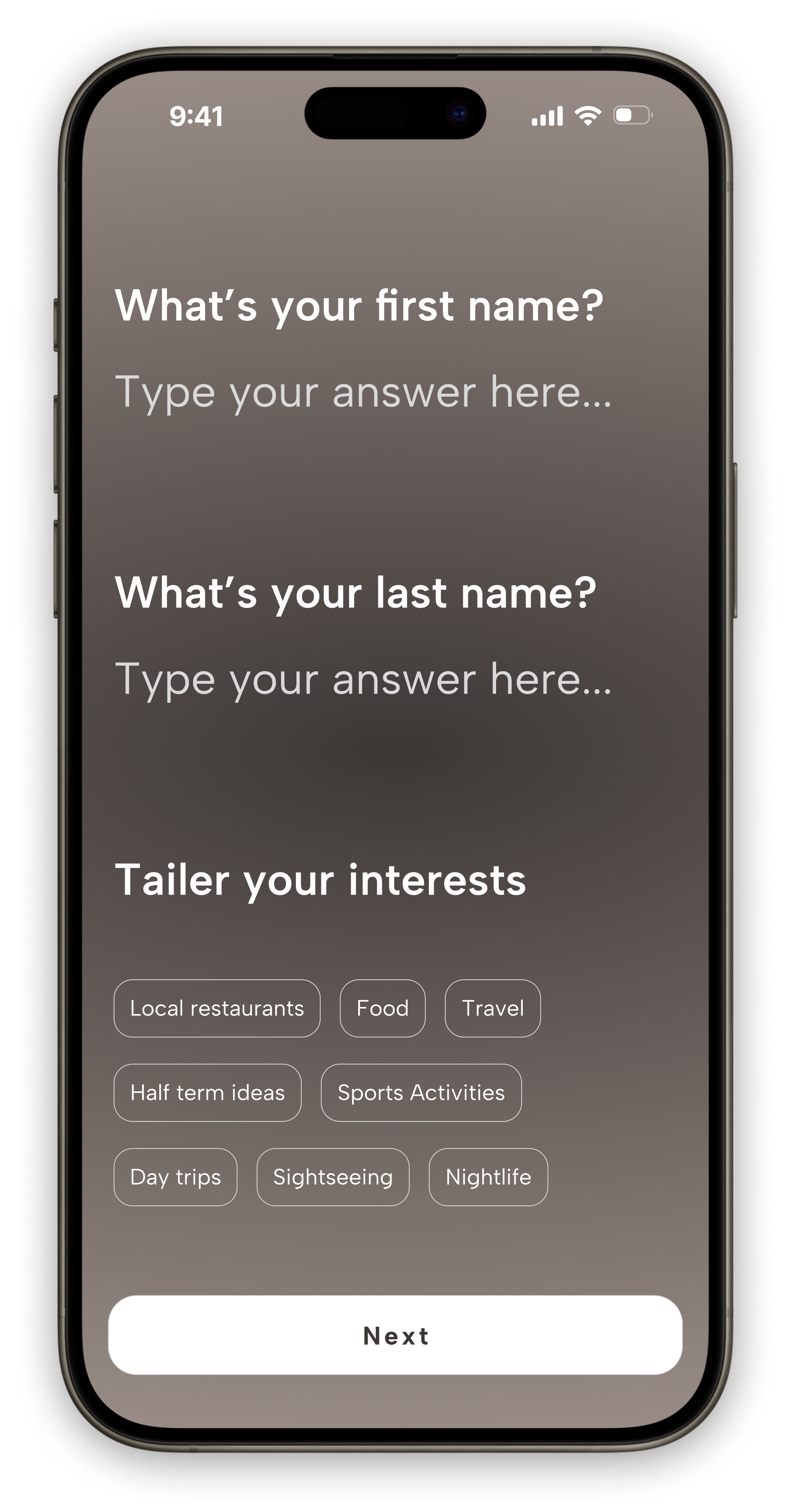
Developing the initial sketches and user flow for the CICERO app provided clear direction on which screens to prioritise for advancement. My primary objective was to craft a smooth, efficient onboarding experience that enables users to immerse themselves in the app as quickly as possible, allowing them to start exploring CICERO’s features and benefits straight away.
User testing
Throughout the design process, I conducted unmoderated usability studies to identify key pain points in the MVP. These insights helped shape the prototype by highlighting areas that needed validation and refinement. Participants completed tasks to uncover usability challenges, leading to the following problems being raised:
Refine the landing page for a more polished and user-friendly experience.
Simplify filters by reducing dropdown menus, ensuring a smoother flow of information, minimising cognitive load, and enhancing usability.
Improve guide profiles for better clarity and a less cluttered layout.
Example of refinement to screens following user testing:


Deliver
Style Guide
Colour Palette: The colour palette was inspired by the Il Dolce Far Niente ("The Sweet Art of Doing Nothing"), a guidebook that celebrates the joy of slowing down and embracing simple pleasures while travelling. Instead of using pure black and white, softer shades were used instead to reduce cognitive overload. The red accent colour was used sparingly only to highlight CTA's and important information.
Components: Kept card designs minimal for easy information processing, while buttons remained simple with subtle variations for clarity and consistency.
Typography: Albert Sans is a modern, clean, and highly legible sans-serif typeface. Its open letterforms, balanced proportions, and generous spacing enhance readability, even at smaller sizes. These qualities contribute to better accessibility, as they reduce visual strain and improve text clarity for users with visual impairments or dyslexia.

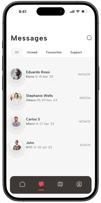
Hi- Fidelity Screens


Final thoughts
As the lead UX designer of the CICERO app, I learned the importance of balancing simplicity with functionality to reduce cognitive overload. Streamlining navigation and minimising unnecessary subcategories improved decision-making and engagement. Iterative user testing was key in refining the experience, ensuring clear UI elements and intuitive filters. Prioritising clarity over complexity led to a more seamless and enjoyable user journey.
Insight 1: Conducted extensive user research and testing, refining the app’s UI to minimise cognitive overload and enhance decision-making.
Insight 2: Collaborated closely with developers to implement a scalable design system, ensuring consistency and efficiency across the CICERO platform.
Insight 3: Designed high-fidelity prototypes in Figma, streamlining user testing and demonstrating key interactions to stakeholders for alignment on product goals
Have a go!