ArchiMaps
-
This case study explores the reimagining of ArchiMaps, an existing app that guides users to significant architectural works worldwide. Despite its potential, the app suffers from an outdated UI, a limited database, and a lack of user-friendly design.
-
User Research & Analysis, Information Architecture, Wireframing. UI Design, Prototyping and Usability Testing.
-
Figma, Adobe CS, hand sketch.
-
Define | Discover | Develop | Deliver

Highlights
Problem
The absence of modern features, such as offline functionality and AI integration, risks alienating new users seeking more interactive experiences.
Re-designing ArchiMaps poses challenges, such as addressing its limited database of 2,700 buildings, which leaves many regions and lesser-known architects underrepresented. While the app has potential to serve architects, enthusiasts, and students alike, it still has a long way to go in its current state.
Goal
Explore the built environment around you with ArchiMaps, transforming your phone into a dynamic visual guide.
In redesigning ArchiMaps, I aim to enhance the user experience with improved interaction, flow, and UI. A key new feature is AI image recognition, enabling users to quickly identify and learn about buildings and spaces via their mobile devices.
Discover
Heuristic Evaluation
Analysing the existing ArchiMap screens
As an architectural design enthusiast, I tested the app and found significant limitations:
Restricted database with poor regional coverage
No offline functionality,
Inflexible maps and events,
Cluttered, user-unfriendly interface.

User journey
User Research: Assessing Value and Confirming Interest
User research revealed key frustration with the current ArchiMaps app: its limited database and outdated features often failed to meet users' needs for discovering new information on the spot.
This insight led me to create a user journey map of the existing app.
Users' interest peaks when they spot a building and want to learn more, but the app's limitations force them to seek alternatives, which often lack curated, building-specific information.

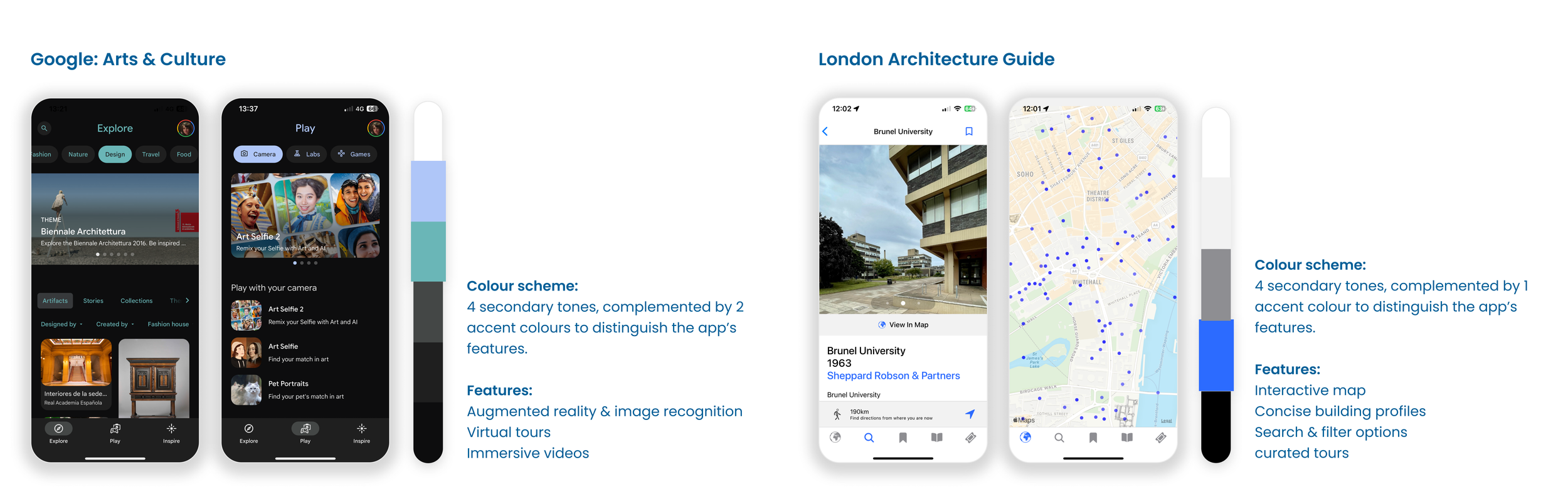
Competitor Analysis
Comparing ArchiMaps to competitors, I realised it needed modernising. Integrating AI could expand the database and enhance interactivity.
While neither app is tailored specifically for architecture enthusiasts, both offer features worth adopting for ArchiMaps. Google Arts & Culture, for instance, utilises AI image recognition and augmented reality effectively in its 'Play' feature. I also analysed their colour schemes and user flows to get inspiration of how to enhance the UI/ UX of Archimaps.
Concept
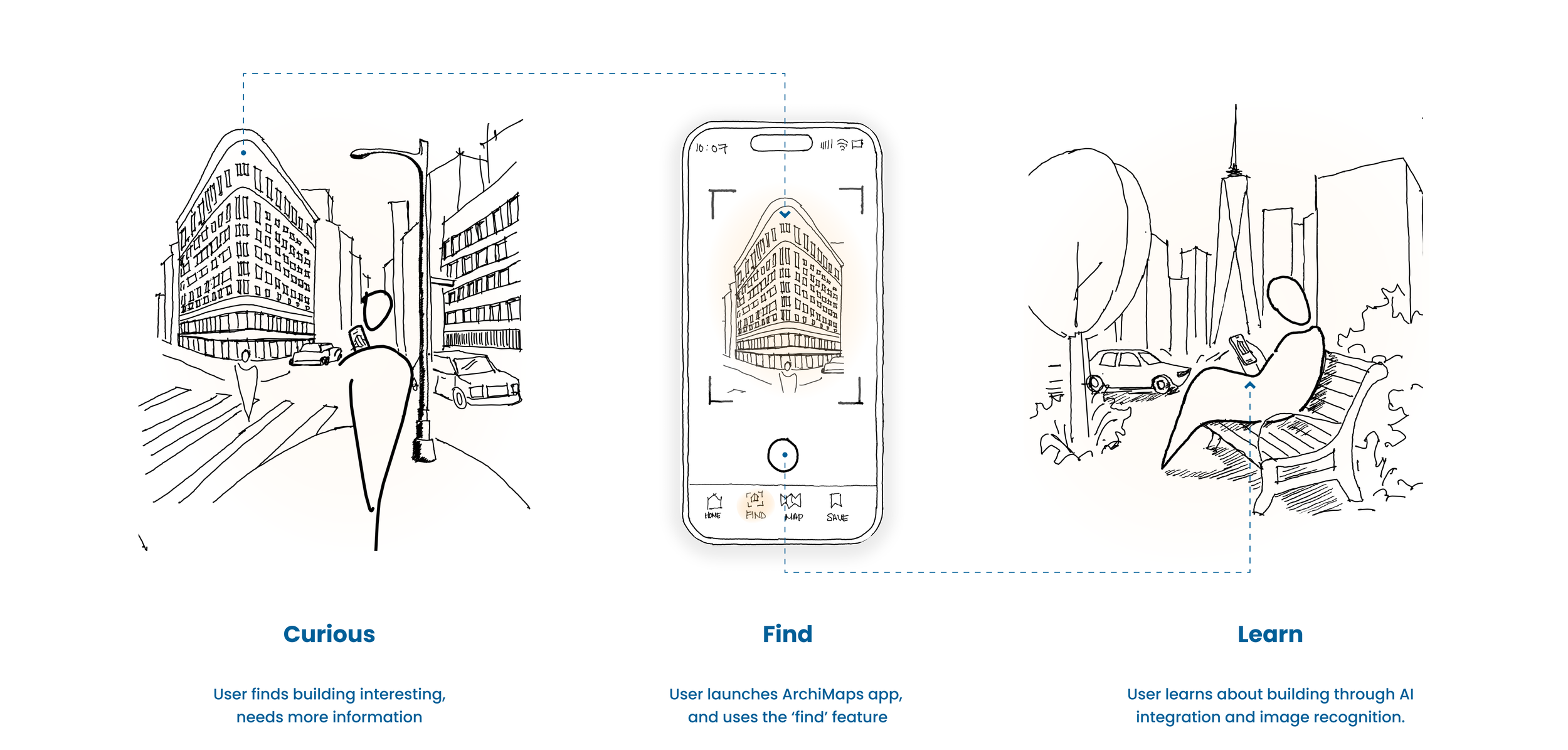
So….how can the app be improved in a new and engaging way for users to interact with the built environment around them?
The new feature, ‘Scan’, enhances the existing ArchiMaps database by introducing an immersive AR experience. It transforms space into a dynamic medium and interface, enabling users to explore and learn through interaction with their surroundings. By integrating AI and AR technologies, ArchiFinder redefines how building information is perceived, digitising the experience for a modern, interactive approach.
Develop
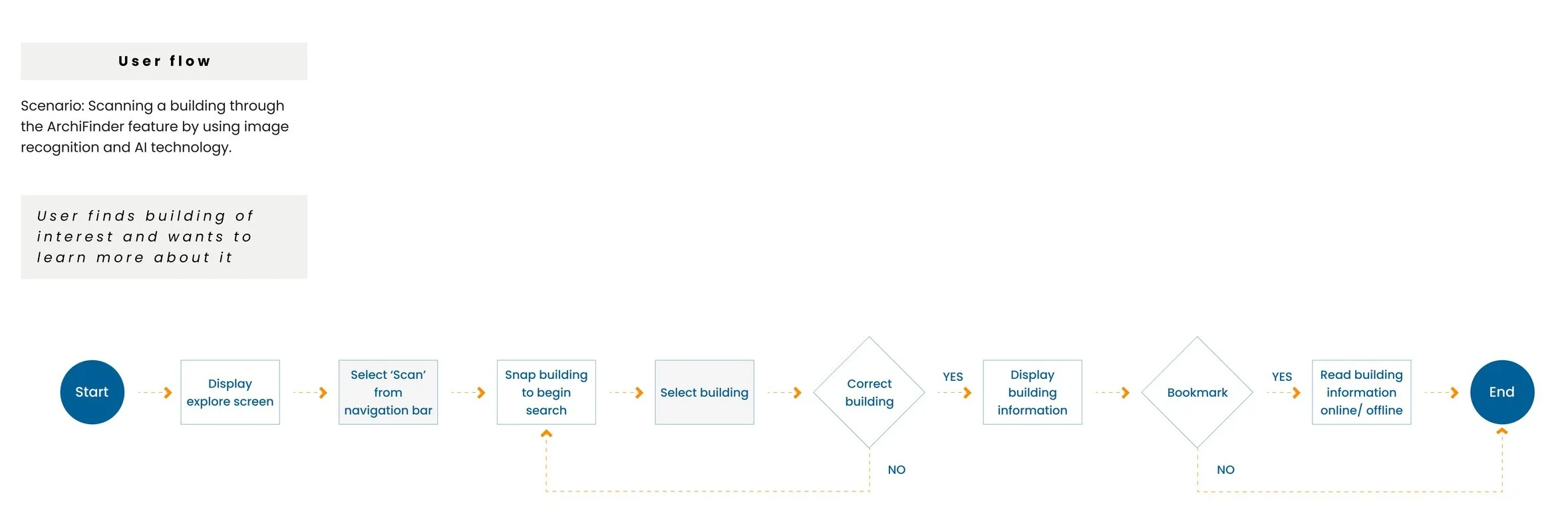
Information Architecture & User Flow:
To integrate the new 'Scan' feature and address insights from the research, I developed a comprehensive information architecture plan and mapped out a detailed user flow scenario.

Mid-fidelity to wireframe:


Deliver
Style Guide
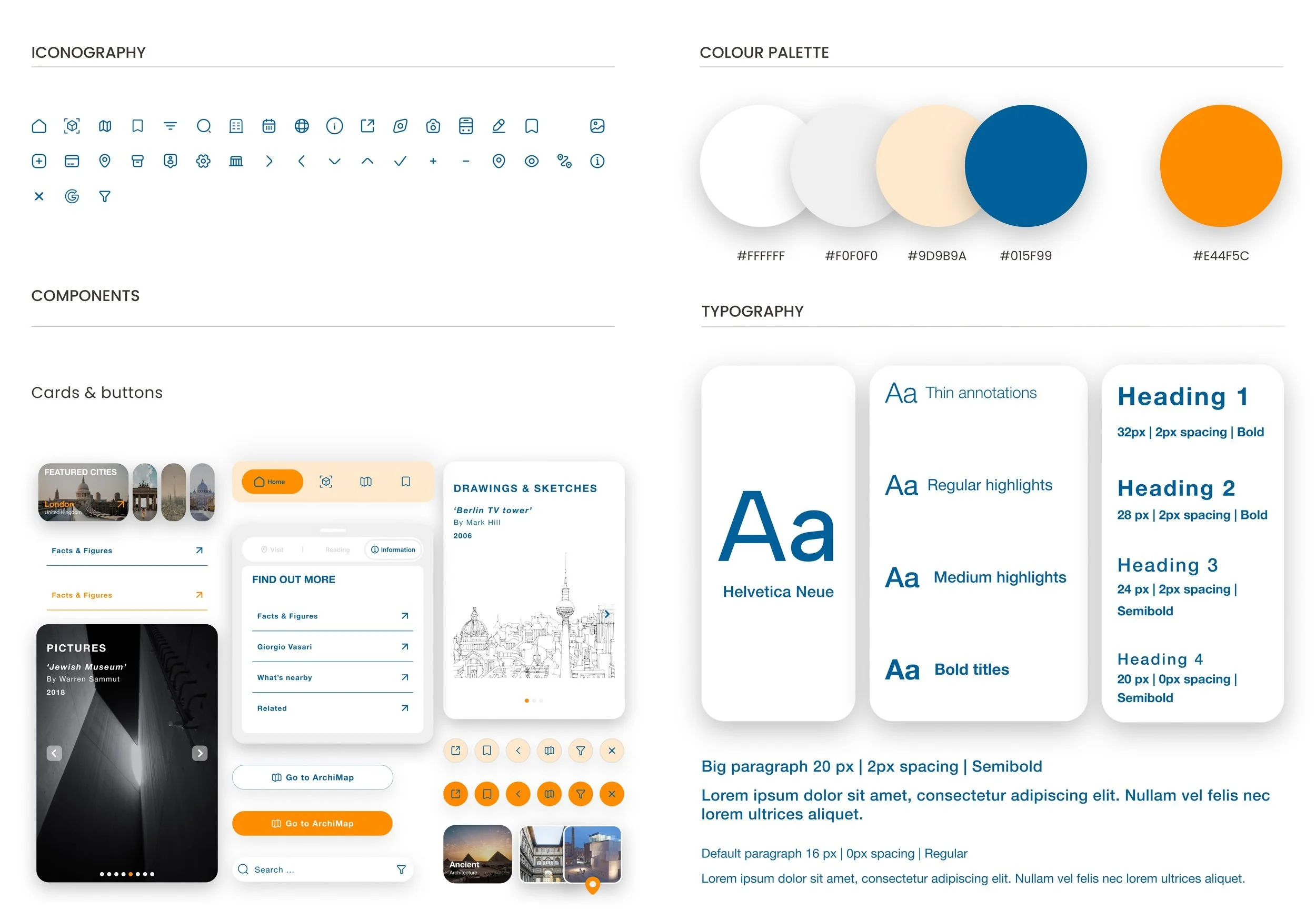
Colour Palette: The app’s UI design draws inspiration from an architect’s sketchbook, with graph paper used as a subtle backdrop to evoke a tactile, exploratory feel—like flipping through pages filled with sketches, notes, and memories. To preserve the app’s identity, the signature orange accent was retained and balanced with a contrasting blue tone, introducing a refreshing dynamic and helping to break the visual monotony of the original design.
Components: A bento-style layout was adopted to break down the large volume of information presented in the original app. This modular approach not only enhances visual clarity but also improves navigation, allowing users to engage with content in a more structured and digestible way.
Typography: Using Helvetica Neue in the Archimaps app enhances clarity and legibility, making it ideal for navigating maps and reading architectural content. Its clean, modern aesthetic supports a minimalist interface while maintaining a professional, design-savvy tone. With strong roots in architectural history and wide device compatibility, it reinforces both usability and cultural relevance for a design-conscious audience.
Protoype
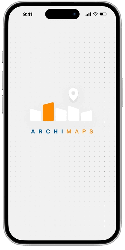
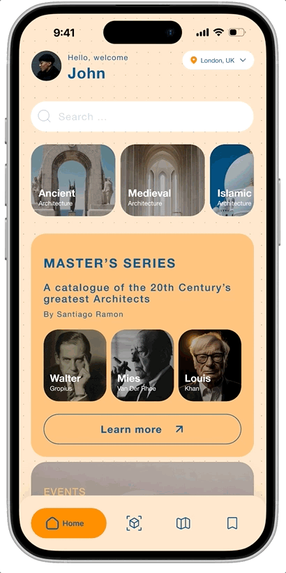
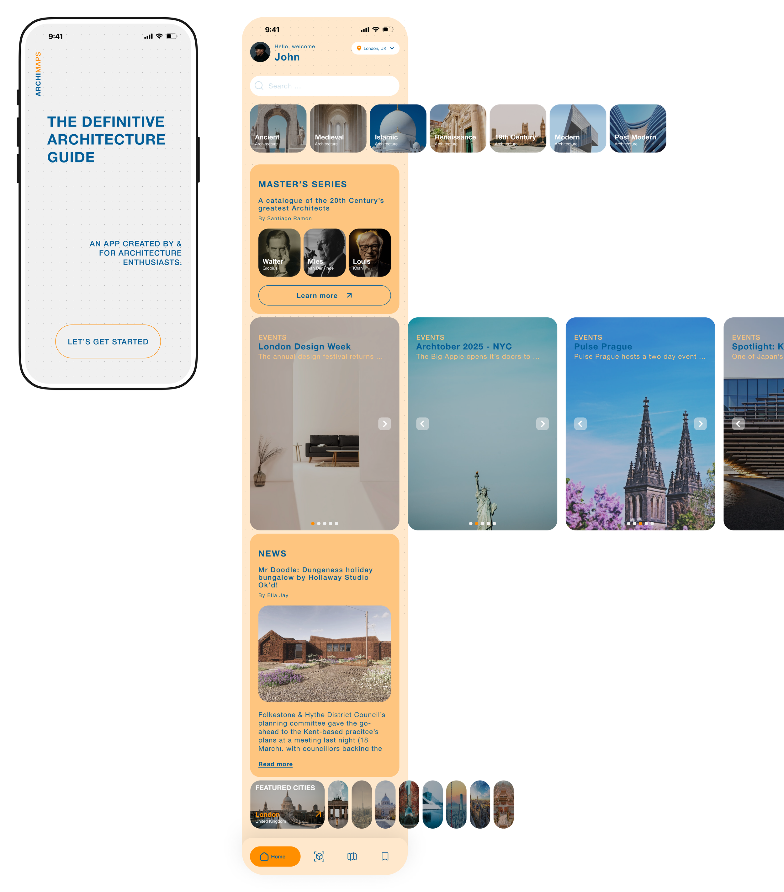
1.Splash & home Screen
Splash screen: Users are now greeted with a sleek and modern splash screen, offering a preview of what the app has to offer.
Home screen: The redesigned home screen prioritises organised and easily readable content achieved with the bento style grid. A new location tab curates information tailored to the user's current location, while the introduction of a search tab—previously absent—allows users to explore content beyond the preloaded options.
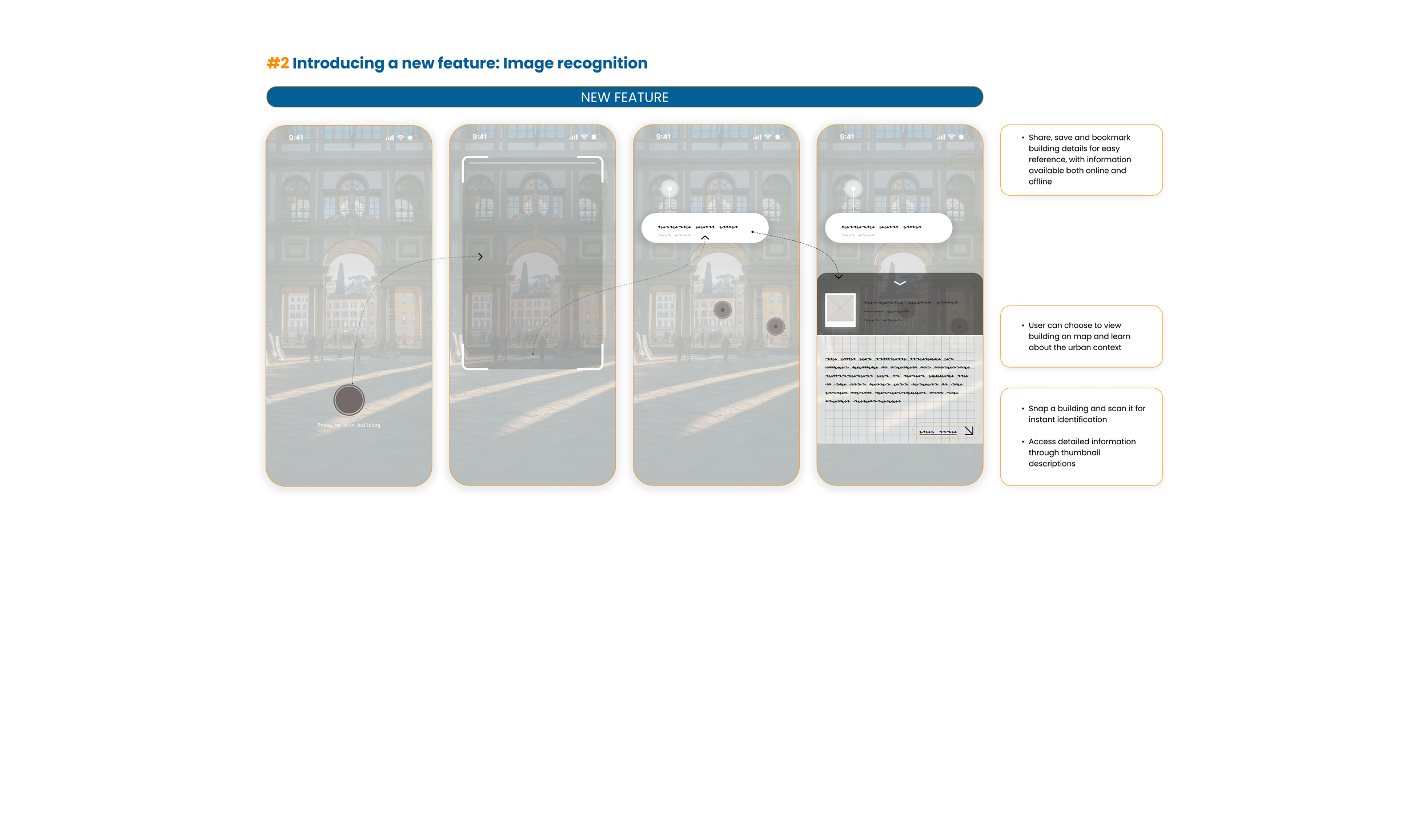
2. New Feature: Image recognition
To make ArchiMaps competitive and enhance the user experience, I introduced a modern feature called Scan.. This function allows users to scan buildings and leverage AI to identify and learn about the surrounding built environment. I envision this tool being particularly valuable for students and educators, offering a powerful resource for exploration and learning.

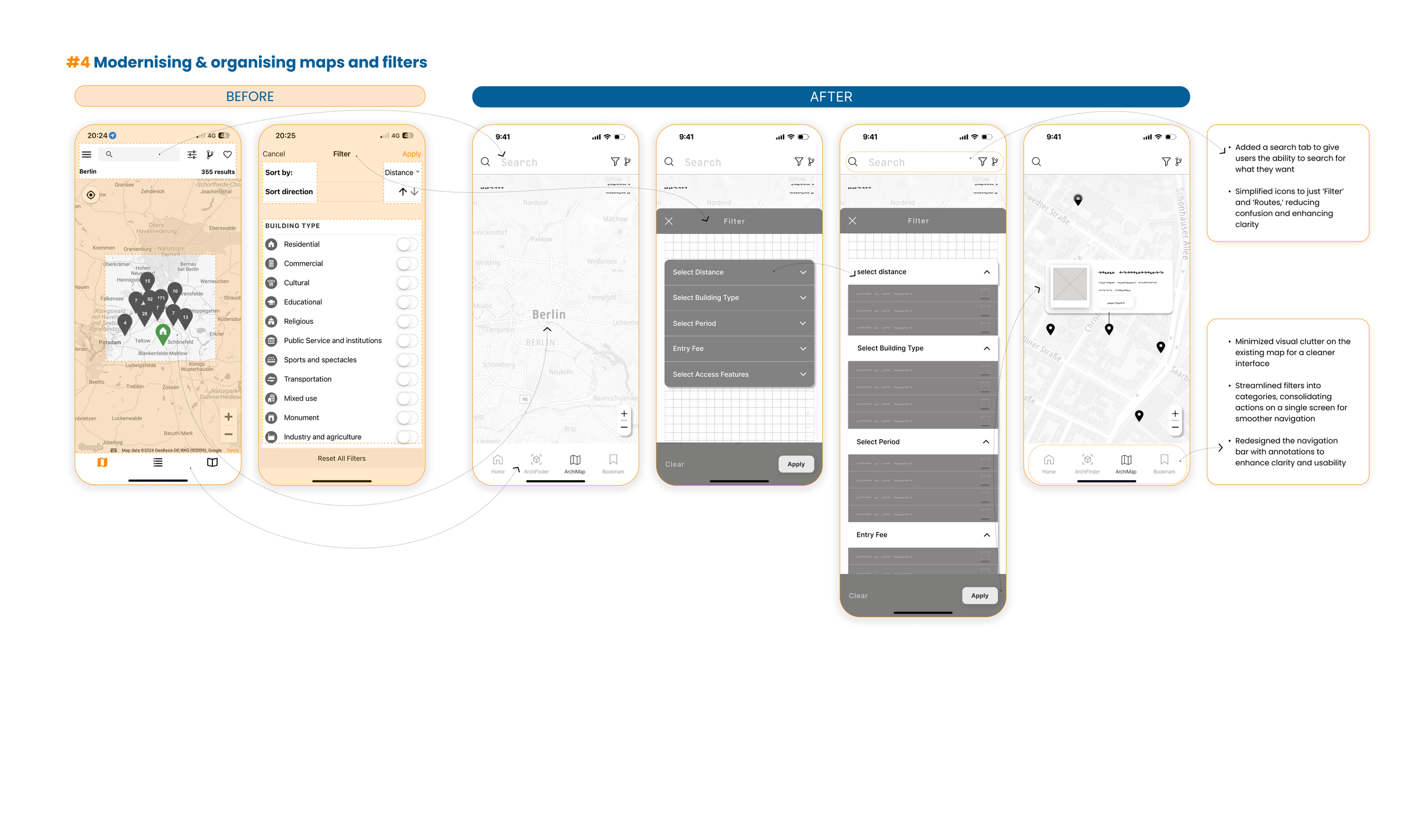
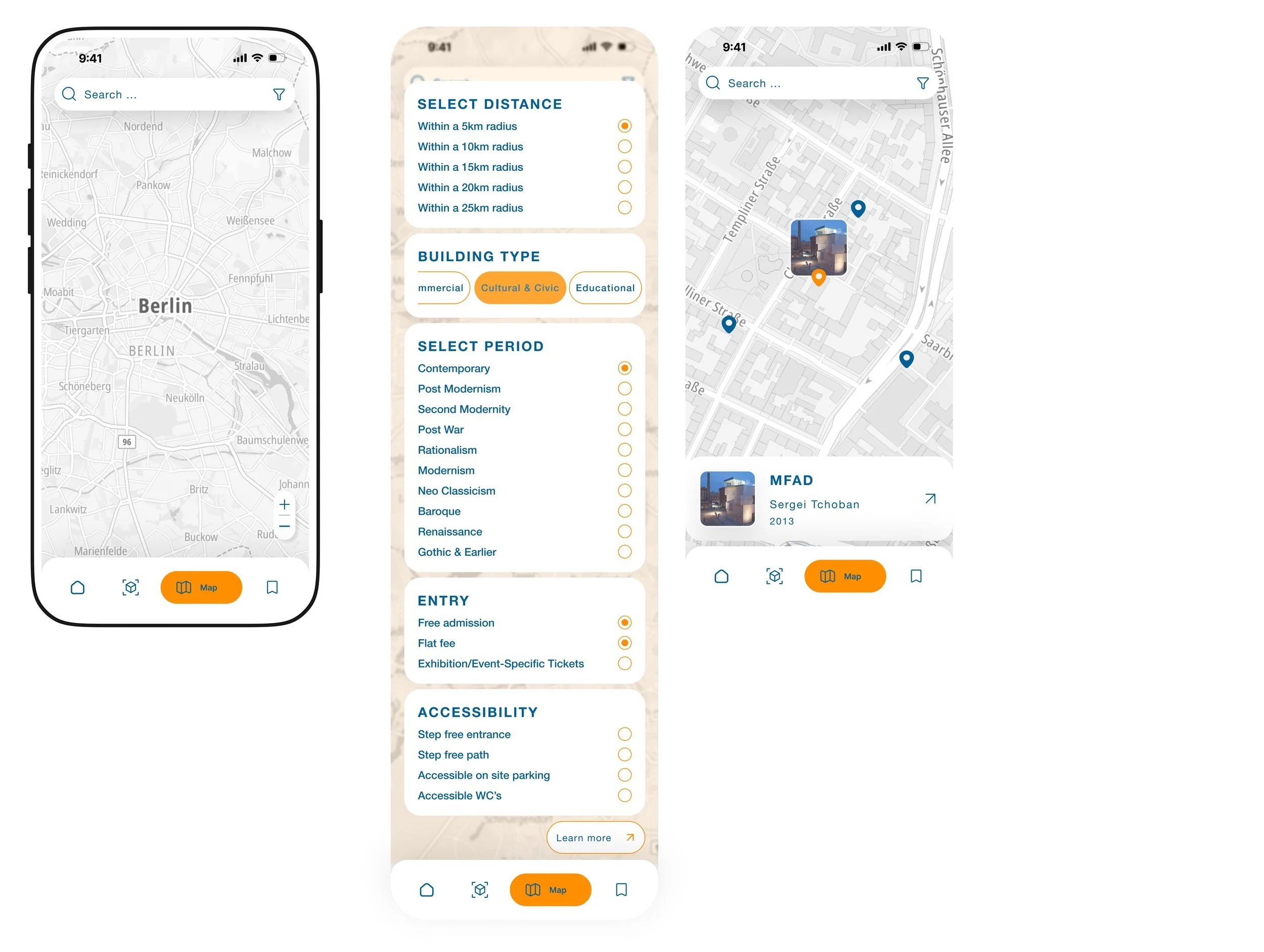
3. Map & filters
Maps: The original app’s map was cluttered, making it difficult for users to interpret information. To address this, I simplified the map, ensuring it remains minimal and displays information only when users input specific search criteria. In the future, I plan to enhance the map by adding notifications for buildings or places of architectural significance when users of the app walk past them.
Filters: The original filter design was overly complex, requiring users to navigate multiple layers to refine their search—a frustrating experience. To improve this, I identified the most important criteria for searching buildings or places and streamlined the process. The refined filters are now consolidated into a single, accessible location for greater ease and efficiency.
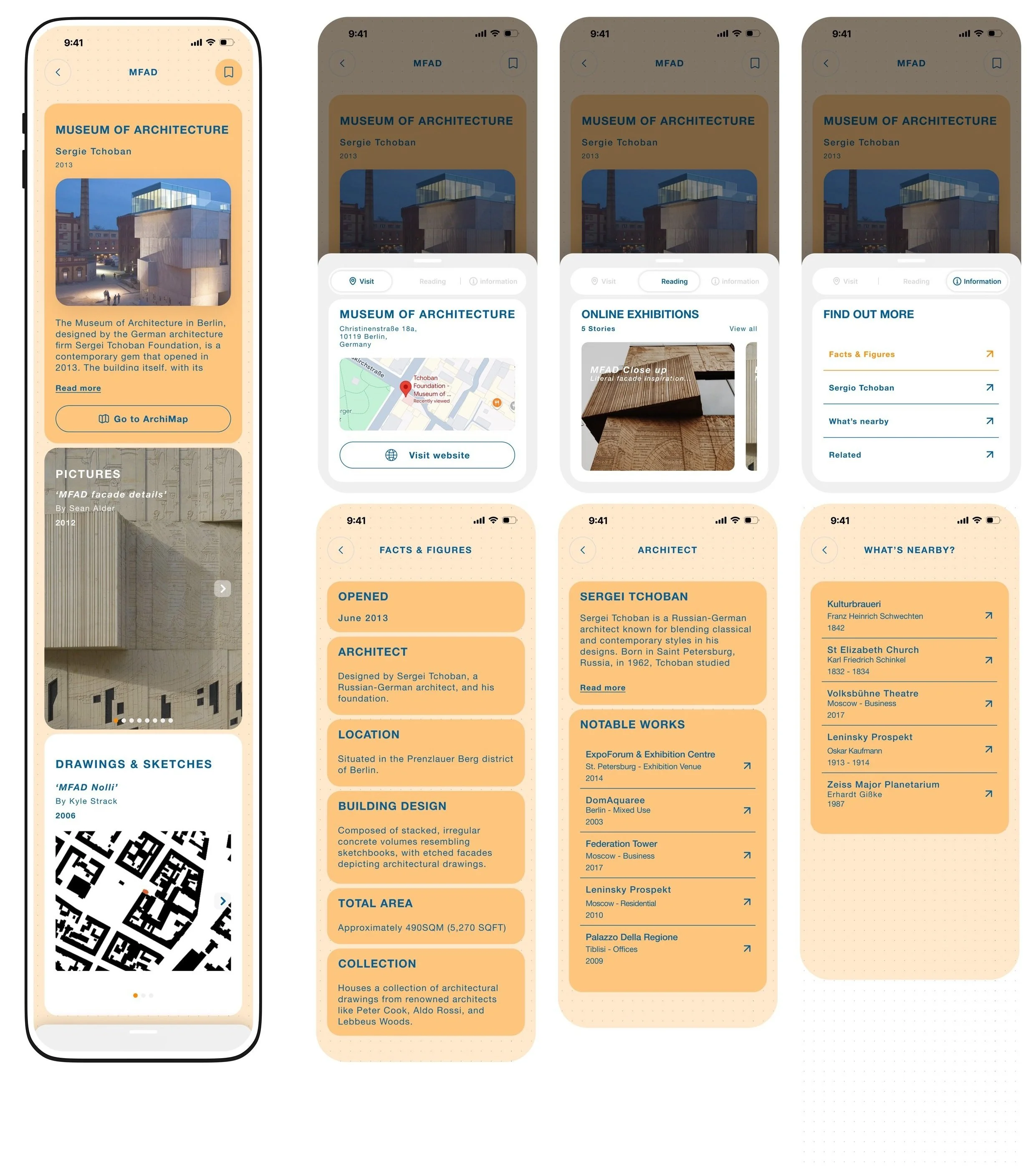
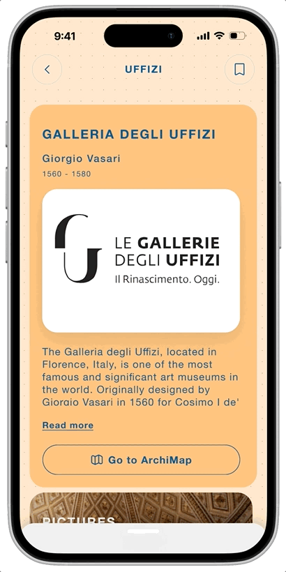
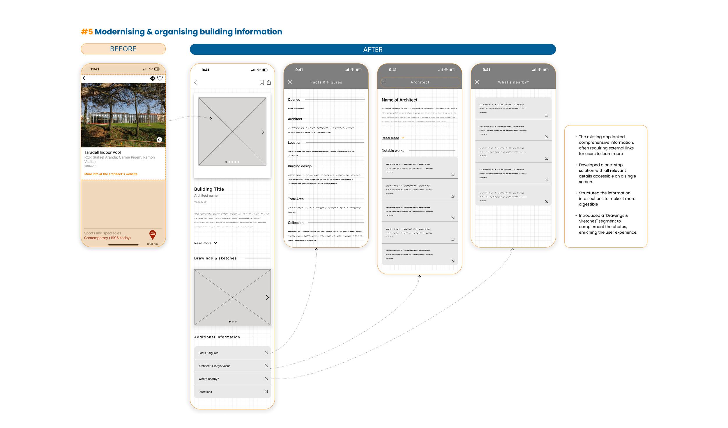
4. Building information & related content
In the original app, building information often relied on external links, forcing users to click through multiple pages to find what they needed. In the redesign, I consolidated all relevant building or place details into a single, accessible location, allowing users to focus on learning without unnecessary distractions.
Additionally, I introduced an "Additional Information" section, offering related content without overwhelming the user. This ensures a balanced experience, providing depth without losing clarity or focus on the original topic they chose to learn about.